
Classic Roots Farm
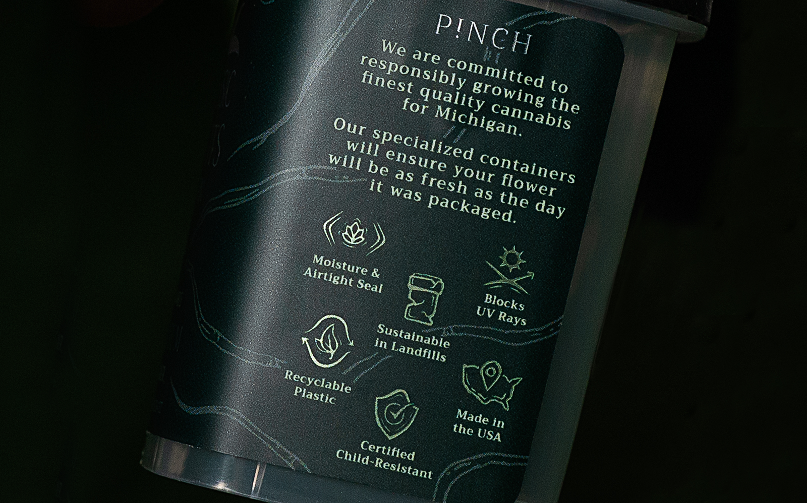
Packaging
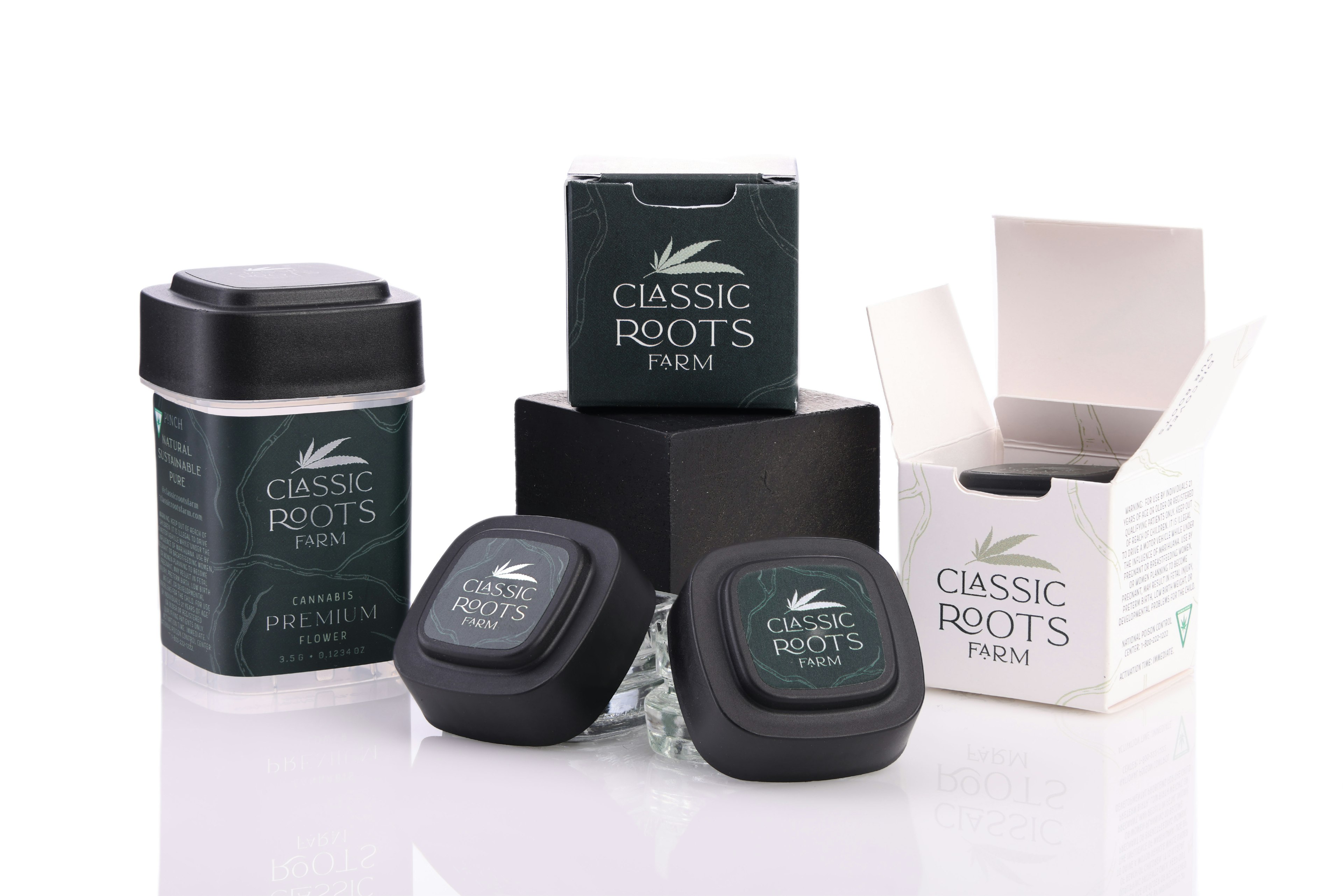
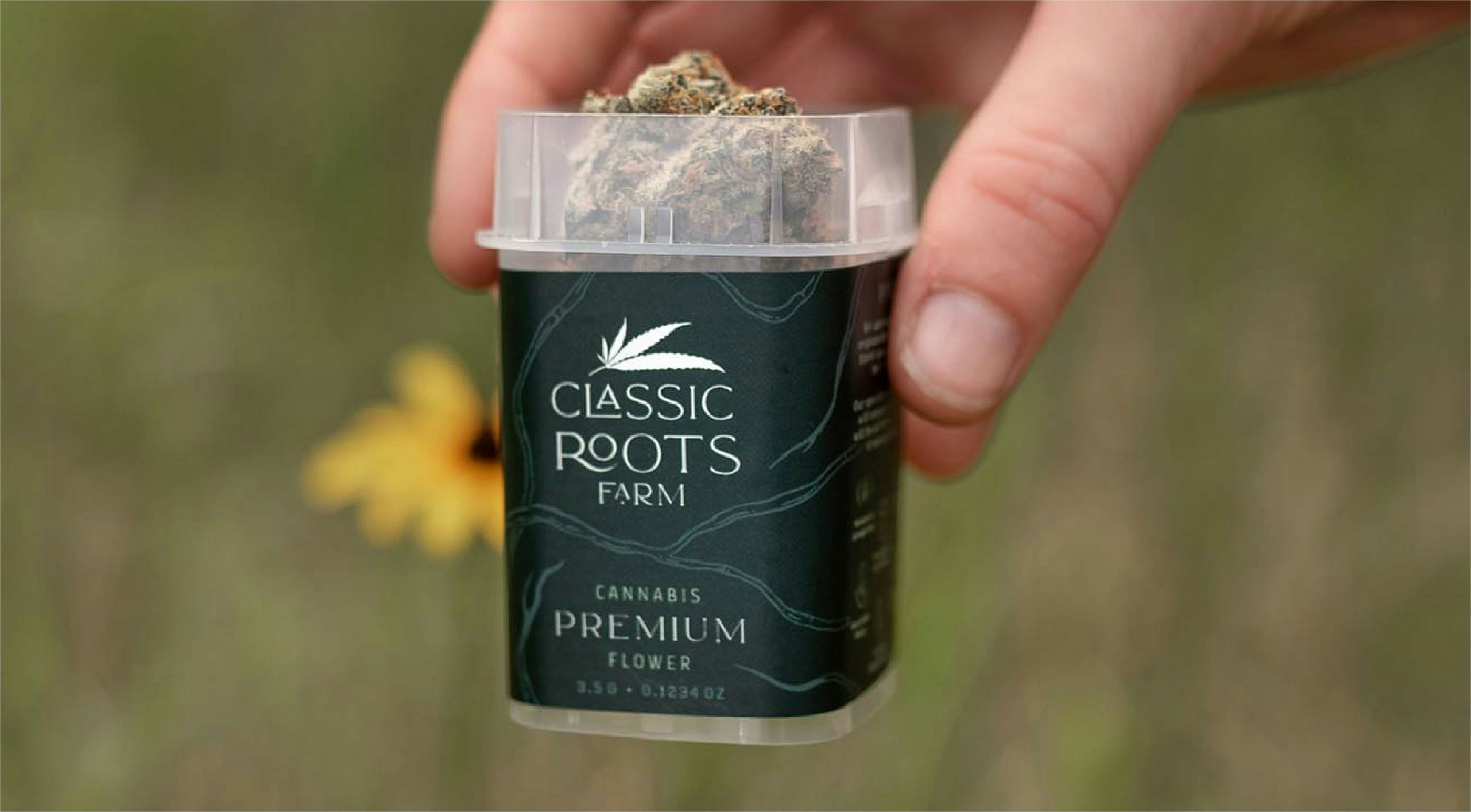
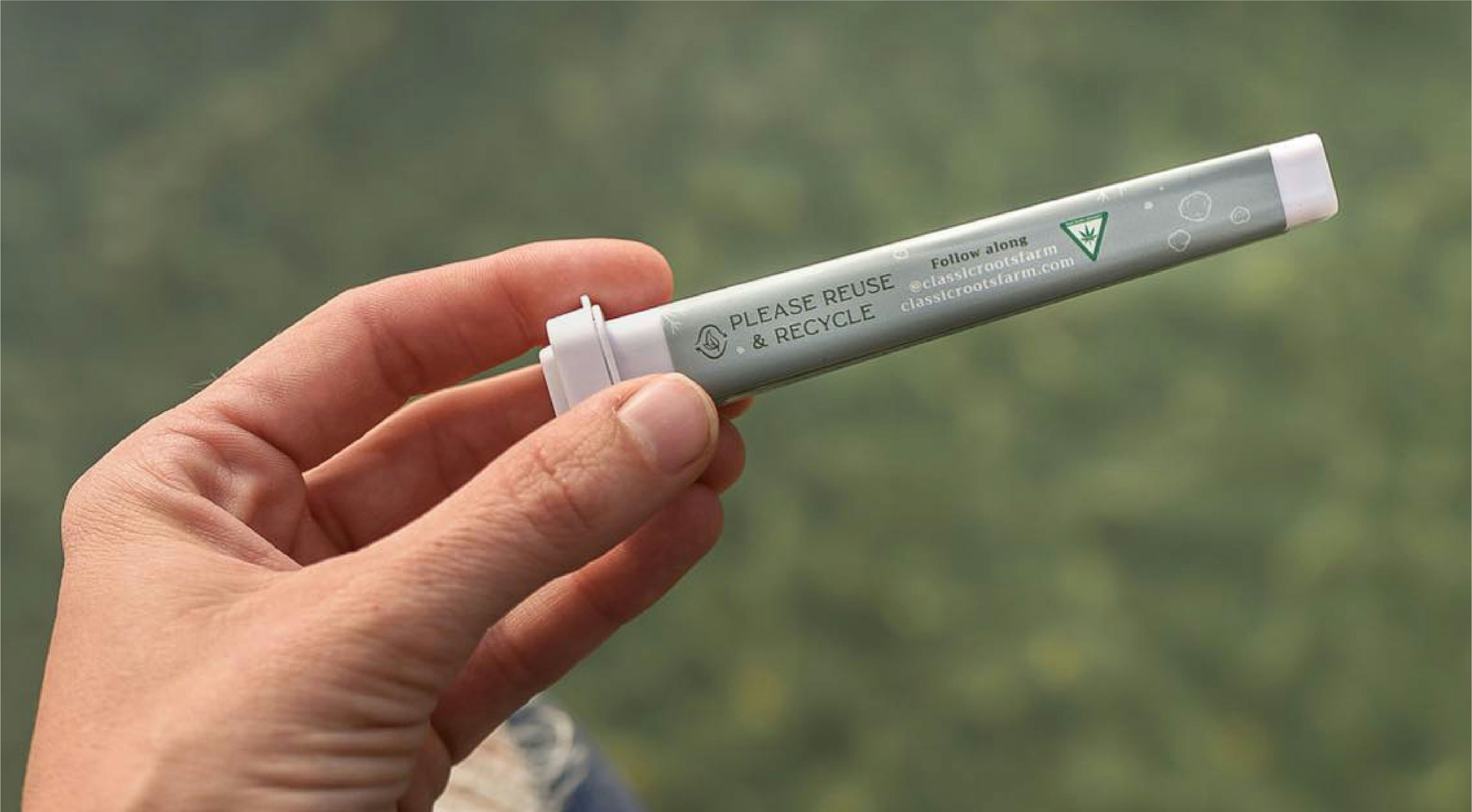
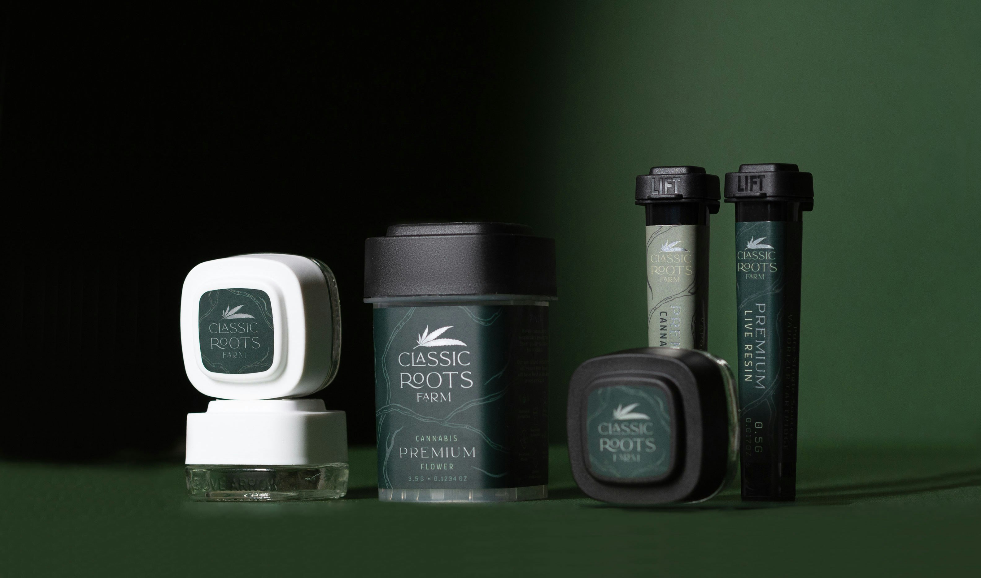
Classic Roots Farm is a craft cannabis brand providing high-quality flower and concentrates to the Michigan market.
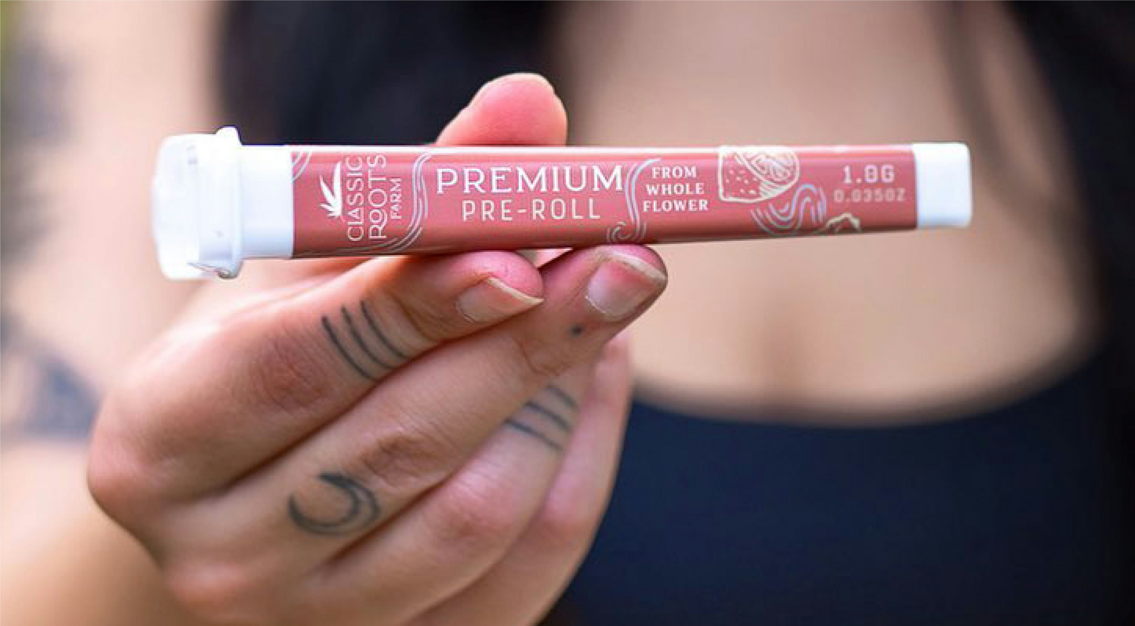
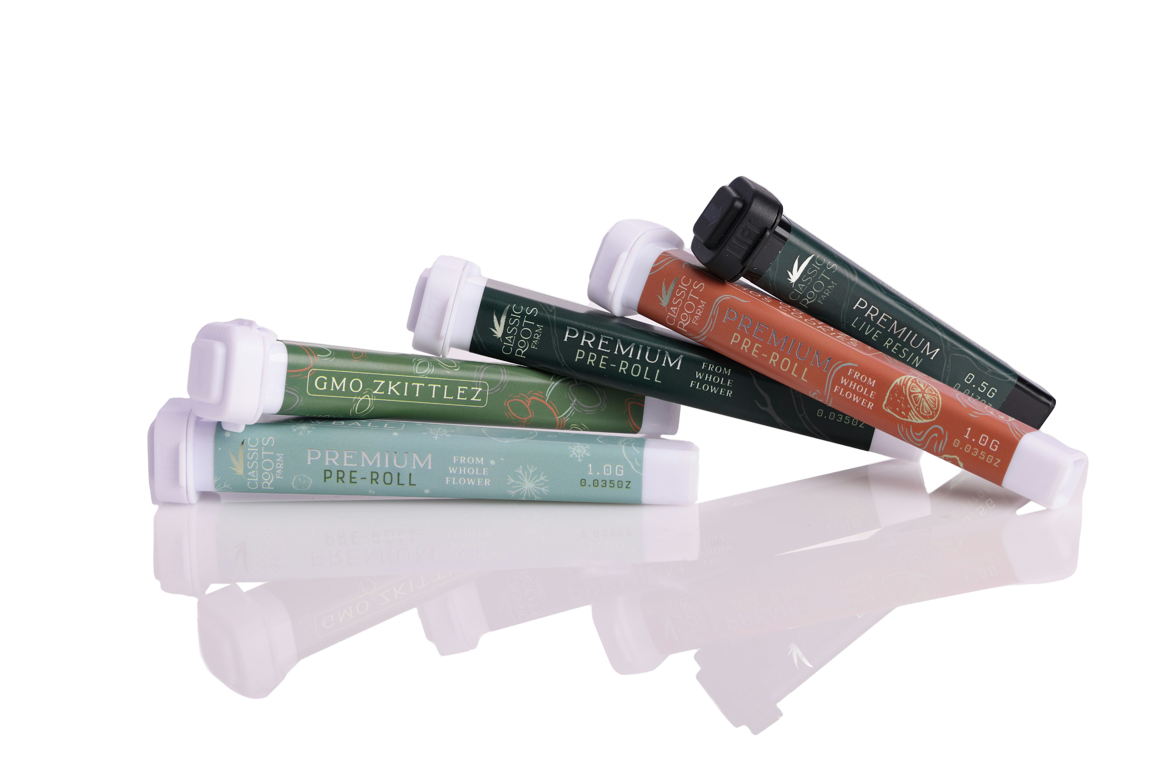
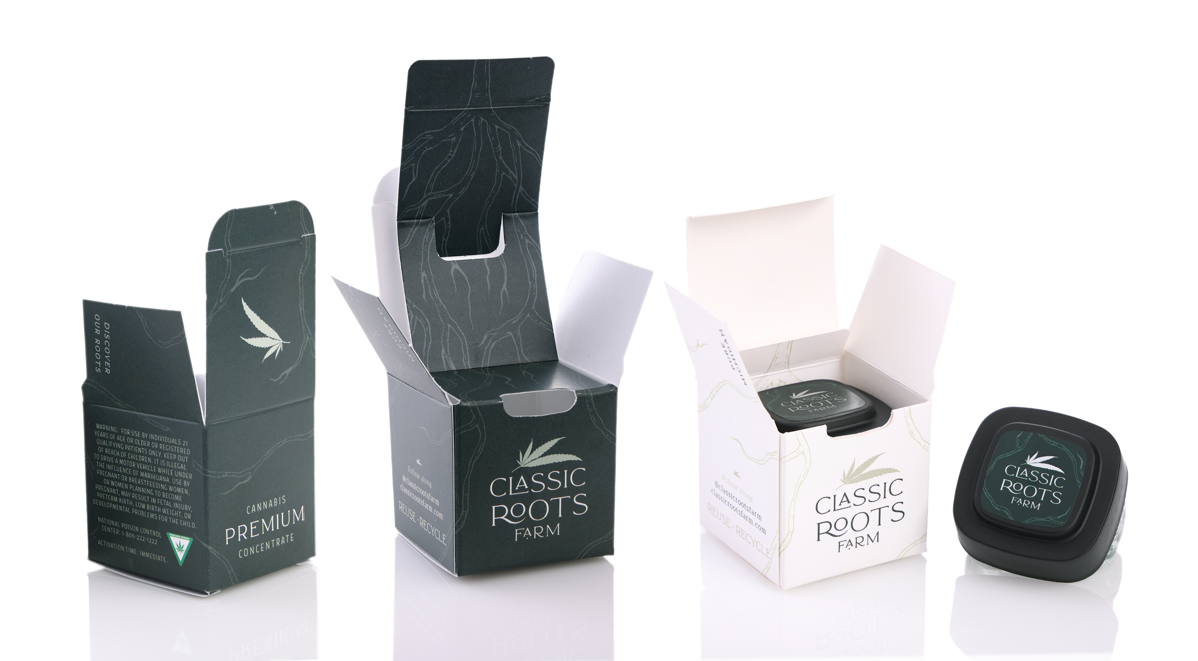
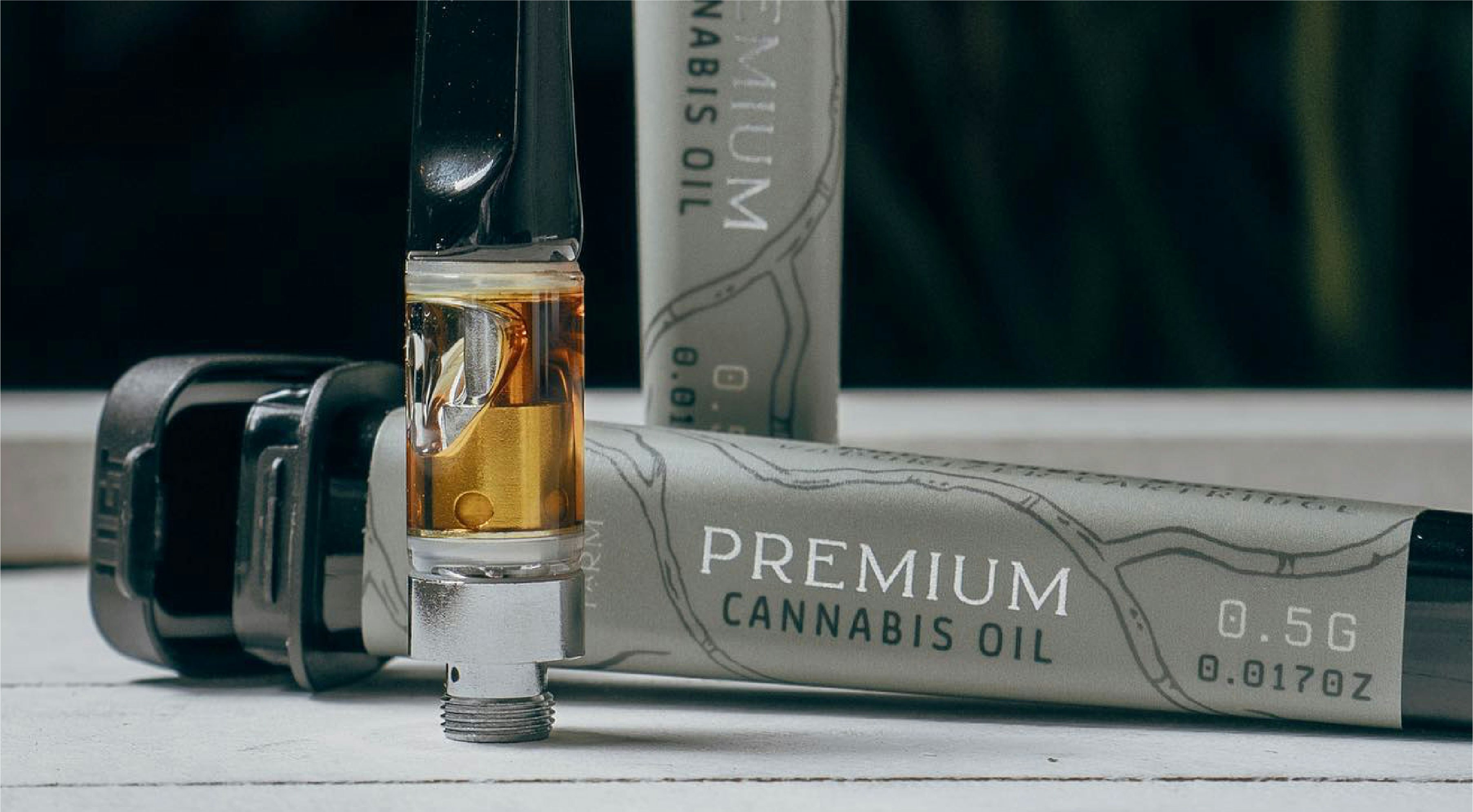
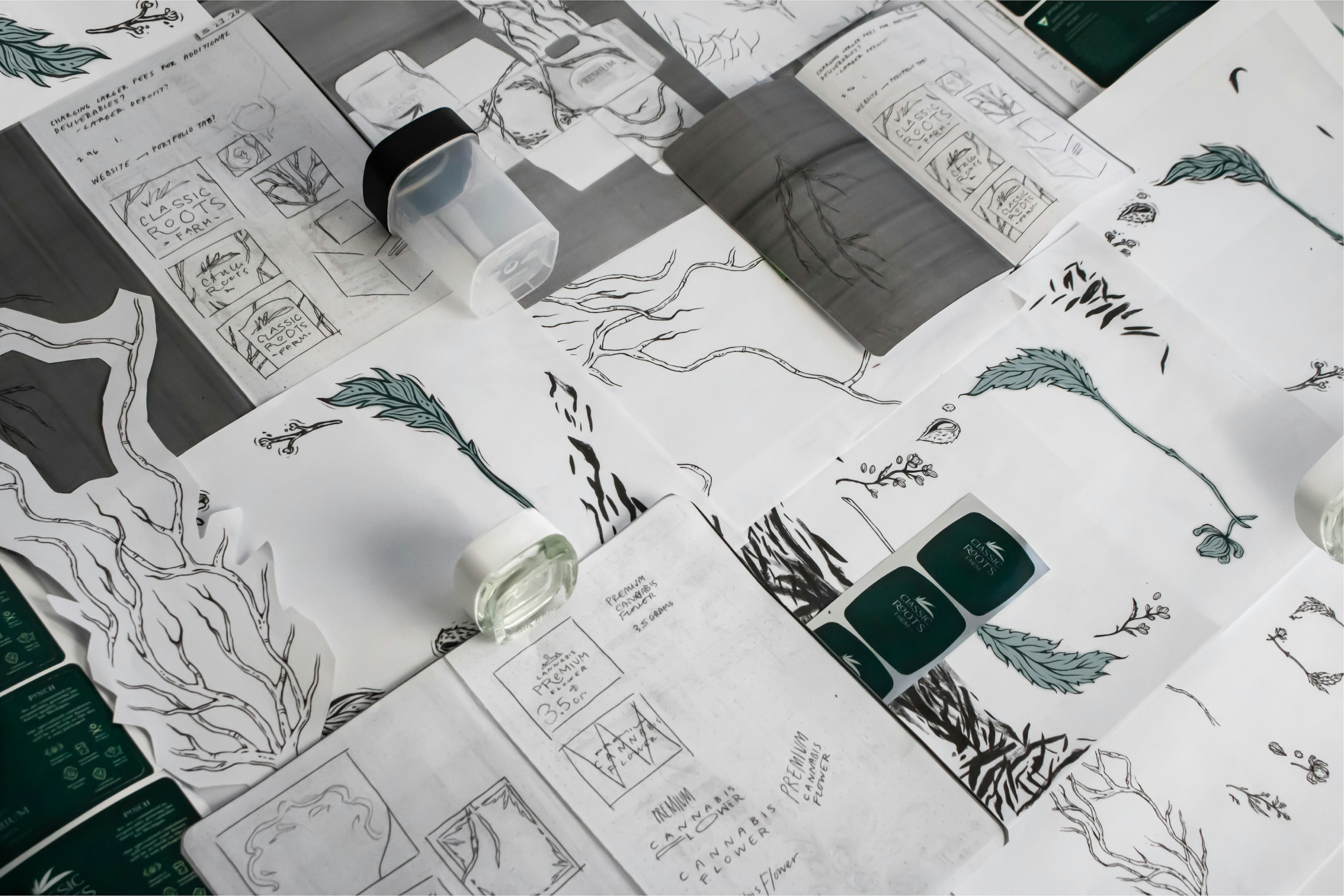
They approached our team seeking packaging designs for the initial launch of their flower. CRF sought to convey their Michigan roots, their commitment to sustainability, and above all, their premier product quality. I choose to communicate these key points using a rich color palette and hand-drawn root illustrations offset by delicate type and metallic accents.
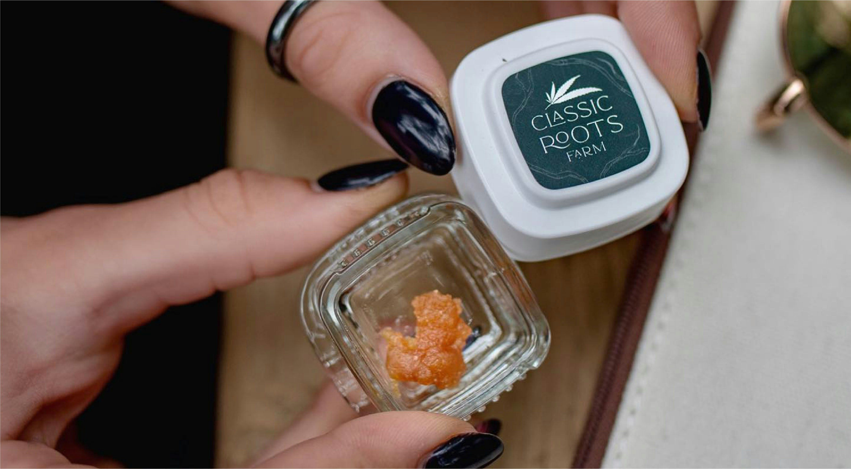
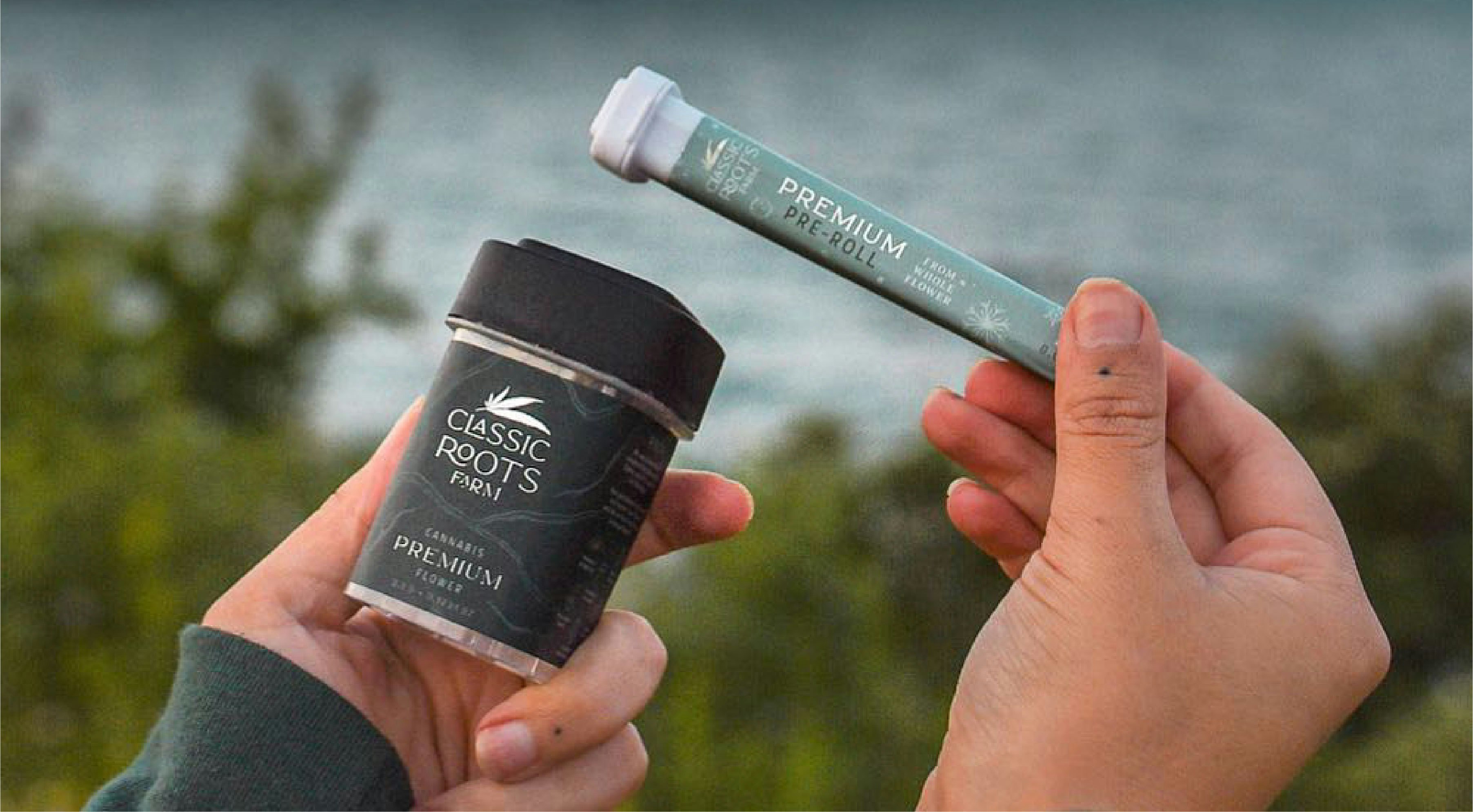
I was reengaged by the Classic Roots' team on a number of additional projects to translate the visual language we developed for their flower onto their Pre-Roll, Cartridge, and Concentrate lineups.
Featured by DesignRush among the Best Packaging Designs for 2024
See quotes below from Jill Gilpin, Classic Roots' Director of Marketing and Business Development:
"Before working with Calyx, we really only had a logo for our company. After sharing our vision and mission, Calyx was able to turn our logo into a true comprehensive brand. We now use many of the design elements to influence all other aspects of our marketing, branding, and our overall story."
“...Every one of our employees and team members is proud to show off our packaging because it conveys our story and who we are.”
LIFESTYLE IMAGERY CREDITS: @CLASSICROOTS.FARM